
Reuse components, variables and variants
Understand shared components and individual instances, then customize buttons and navigation without accidental global edits.
Soidesmax · 4 min read · Updated 2026-10-20
The problem components solve
Imagine North Studio has the same button on eight pages. Copying eight independent buttons makes future changes tedious. A component provides a shared design; each placement is an instance. Variables expose selected content or options, while variants offer different appearances or layouts.
Your exercise is to inspect an existing button component and use it in two places. Work in the practice project. Avoid detaching instances merely to make a small text change; doing so can remove useful shared behavior.
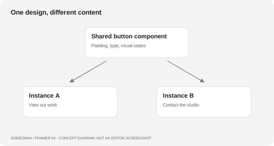
Original component model, not a capture of Framer's interface.
1. Tell a source from an instance
Select a button already on your page. Inspect the right panel for exposed controls such as label, destination or variant. Rename its label through those controls when possible. Enter the component editor only when you intend to change the reusable design itself.
Create two instances in your practice layout: View our work and Contact the studio. Give them different destinations. A good component allows both instances to share padding, shape and typography while retaining their own meaningful content.
2. Understand variants before editing them
Open the component and identify its primary variant. Framer's current variant model uses the primary variant as the shared structural source. Standard variants inherit from that primary source, including variants created by duplicating another variant. A property changed on another variant becomes an override; resetting it restores inheritance.
Use a second variant for an intentional difference such as an outlined button. Do not create a separate variant for every label. Labels belong in content controls when the component exposes them.
3. Separate appearance from interaction
Hover and press states are associated with a particular variant. Inspect their interaction and Preview the result. Make the change subtle: a border or surface shift is enough for this practice button. Essential information must remain available without hover, because phone users do not interact with a mouse pointer.
If using the template's navigation, test its mobile menu as its own interaction. Open it, activate a link, close it and open it again. A convincing static picture is not evidence that the menu works.
4. Make one controlled shared change
Change the shared button padding slightly and return to your page. Verify both instances. Then change the first instance's label and verify that the second label stays intact. This simple exercise reveals the boundary between reusable styling and local content.
For a real template, exposed variables vary by author. If a control you need is missing, inspect the source carefully and use official component learning material before rebuilding it. Keep a copy of the working version so experimentation remains reversible.
Troubleshooting
- One instance does not match: it may have an override. Inspect the changed property and reset only the unwanted difference.
- All labels changed: you edited common source content rather than an instance variable.
- Phone typography ignores page settings: components do not necessarily inherit page breakpoint behavior in the way you expect; check component-specific sizing and variants.
- Animation feels distracting: reduce the movement and check the underlying state before adding effects.
Finish this lesson
You should have two buttons with shared styling, independent labels and tested destinations. Keep these as the basis for later pages.