
Build a responsive page with breakpoints
Understand primary layouts and overrides, then test your template between desktop, tablet and phone sizes.
Soidesmax · 4 min read · Updated 2026-10-20
Your goal
Make the North Studio hero readable on a large monitor and a narrow phone. A breakpoint is a width-dependent layout rule, not a separate website. Testing only the labeled Desktop and Phone views misses the widths between them.
Before changing anything, duplicate the practice project if you want an extra checkpoint. Choose one representative page rather than redesigning every page at once.
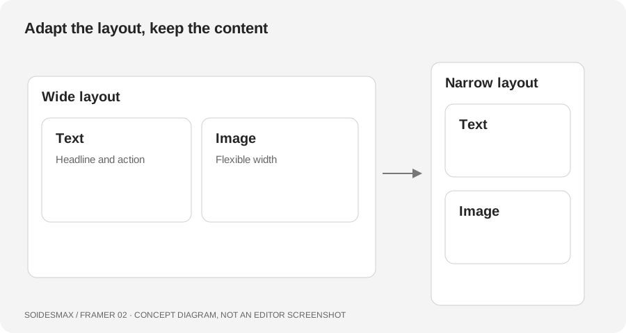
Original layout diagram. The widths below are practice test sizes, not Framer's mandatory defaults.
1. Inspect the existing layout
Select the Home page and examine its breakpoints. A template may already include desktop, tablet and phone configurations. Start with its existing structure. Add a missing breakpoint using the page's breakpoint controls; do not make an unrelated new page called Mobile.
Identify the primary breakpoint and select the hero's parent container. Note its direction, width, gap and padding. Then inspect the headline and image. If a child is wider than the available screen, changing the page width alone will not solve the overflow.
2. Make the main layout flexible
For this exercise, use a horizontal Stack on a wide screen with text and image as children. Prefer flexible widths inside a container with a sensible maximum width. Let paragraphs grow vertically instead of assigning a height that clips longer content. Lesson 5 explains sizing choices in more detail.
Use your own content now: a headline, two short sentences and a button. Longer real text often exposes problems hidden by short placeholder copy.
3. Add intentional small-screen differences
- Select the narrower breakpoint.
- Select the hero Stack and change its direction to vertical if the columns no longer fit.
- Reduce side padding while retaining a comfortable edge around the content.
- Adjust the headline size and line spacing for readability.
- Check navigation, buttons and the image crop. A desktop menu may need an existing mobile menu variant.
Properties changed on a narrower breakpoint can become overrides. If a later desktop change does not appear there, inspect the overridden property. Reset an unwanted override rather than manually repeating the same value everywhere. Component behavior can require separate component work; do not assume a page-level text breakpoint automatically controls all component typography.
4. Test continuously, not only at endpoints
Open Preview and move through approximately 1440, 1024, 768, 390 and 320 pixels. Pause just before and after each layout transition. These are suggested checks, not a device compatibility guarantee. Look for horizontal scrolling, chopped text, overlapping buttons, awkward image crops and menus that cannot be reached.
Try a longer headline. If it breaks, fix the layout instead of shortening every future headline to fit the first example.
Diagnose common problems
- Horizontal scroll: inspect fixed-width children, large minimum widths and absolute positioning.
- Empty gaps: look for fixed heights left over from the desktop layout.
- Text shrinks but the card does not: inspect the parent and its sizing rules.
- Breakpoint preview unavailable: check the editor viewport; Framer may disable previews that cannot fit accurately.
Ready for lesson 3?
Your hero should remain readable throughout the test range, without sideways scrolling. Test the menu and primary button with an actual click, not just a visual glance.